Saturday, July 30, 2011

Making a male skin - Part 1

Hi Everyone!

I've noticed quite a few people are looking for how to make male skins.  I created a pretty complete description of how to make a female skin here:

http://robin-makingstuff.blogspot.com/2011/02/youre-new-skin-step-1-gimp.html

And I offered a little help here in finding a starting point for a male skin:

http://robin-makingstuff.blogspot.com/2011/07/making-male-skin.html

But this is an old skin from Eloh and I knew it had some problems.  So I thought I'd open it up, take a look, and see if I could figure out how to make a nice male skin using Eloh's lf0y (ell eff zero why) as a starting point.

So for this post, I'm going to assume that you have read through the Female skin posts and the single Male skin post (those links given above).  And that you've downloaded and unzipped the lf0y_pdss.zip file.  The next step is to load fhe files into GIMP and take a look:


Yikes!!

If you click on the image above you will be able to see a larger version.  Here's what I see when I do that:
  • The overall color is too light
  • The highlights are too bright and the shadows are not dark enough
  • The lips are too white
  • The inner mouth is very weird
  • The eyes are scary!!
After doing a search for PSD to GIMP translation issues on google, it is clear that GIMP has limits when reading PSD files and we have encountered a bunch of them in this file.

Sooo..... what to do?

It's my guess that some of the problems are being caused by simply having too many layers turned on.  So we'll go through the file and turn off a bunch of layers and see if that helps.  Here's what I did:
  • Find the 'eye glitter' layer (its near the middle of the layers list) and turn it off, and turn off EVERY layer above it all the way to the top of the list.
  • Find these layers and turn them off too: marks, freckles, lipstick(pale), lipstick (pale) copy
  • Find lip gloss, eyebrow med, eyebrow med (copy) and turn them back on (they're toward the top of the layers list)
Let's take a look at the results with these changes:


That's a big improvement!  But still not quite right. Let's try to do something about the base color.

I loaded the image above (made with Windows snip tool) into GIMP and used the GIMP color picker to sample the snapshot of the QuickTime window and found that HSV = 24,42,89.  So I made a new base layer for our face file and used the paint bucket tool to changes its color to HSV = 24,42,89.  Here's the result:


That's much closer.  The highlights still look too light to me, but its now worth making skin textures and uploading them to see what we have.

Since I made the Female Skin posts I have switched over to the new Firestorm Viewer.  It is based on viewer 2 code but adds some of the version 1 features back in so its something of a hybrid.  Like Phoenix, it allows temporary uploads, here's how to use it:
  1. Save the file as an xcf file:  Click File->Save As and type in face 110730.xcf.  (the number is the date in yymmdd format).
  2. Save the file as a texture:  Click File->Save As and type face 110730.png.  (save the other two as jpg files)
  3. Start up Firestorm and choose Build->Upload->Image, select the file to upload and tick the Temporary box.
  4. Click the Inventory button to see the inventory, and then click the inventory button at the bottom of the inventory to make an inventory window on the left of the screen. 
  5. Wait for the textures to complete loading and then right click your avatar and choose Edit -> Edit Outfit ->  Body Parts  choose the skin and drag each of the uploaded textures from the inventory into the proper slots on the edit window.
You can do this with the V2 viewer of course, but it doesn't have the ability to load temporary textures so each texture will cost you 10 lindens.  Or you can continue to use Phoenix as we did before.

I rummaged around in the Library to find a shape that wasn't too awful and settled on 'boy next door'.  Now let's look at the skin under several lighting situations and decide what needs to be done...


The image shows the view of the lf0y skin as we have modified it so far under the different graphics settings available in Second Life.  From the left to the right, we have Low, Medium, High and Ultra.  If you do this you might see something different, it can depend on your graphics hardware. The graphics hardware on my laptop gets iffy on the Ultra setting so its possible that those with spiffier hardware will see something different there than what I show above.

Ok.... first the good news.  One way to judge a skin quickly is to look for a seam between the upper and lower textures.  Seeing a seam or any line at all in the neighborhood of the avatar's waist is very bad.  The good news here is that I see no seam.  Yay!

Now the bad news.  Under the Low and Medium graphics settings the skin lacks definition.  The shadows are too light and the highlights too soft.  Under High and Ultra graphics settings the highlights are too harsh, too bright.  In fact, looking at the back views under High and Ultra, the entire skin is too light.

And worse, the skin looks rather too smooth and lacks body hair on the arms, legs, chest, abs and chin.

So we have our tasks laid out before us:
  1. Darken the skin, giving it more definition.  More definition here means more shadows for the most part.  We will need highlights too but will need to be careful that the highlights are not too bright so the skin still looks nice under High and Ultra graphics settings.
  2. Give the skin a little texture, some imperfections so its not quite so baby-smooth and soft looking.
  3. Create body hair.  At the moment, I think this comes in three forms.  Pubic hair, whiskers (chin hair) and general body hair for the legs, arms, chest and abs.
I will work on these things over the next week or so as time permits and post my results as they are ready.

*blows a kiss*
robin

Thursday, July 14, 2011

Sandy Bridge - more on Performance in Second Life

Hi everyone, 

I've found that Lenovo has a very nice feature in their Power Manager thingie that shows you the percentage of Turbo Boost (over-clocking) that you're getting on your processor(s) and the on-chip graphics unit.  My laptop has Intel's i5-2410M, so has a nominal processor frequency of 2.3 ghz and a max of 2.9 ghz.  Its on-chip graphics unit, the HD 3000, has a nominal fequency of 650 mhz and a max of 1.2 ghz.  You can get the full specs here if you're interested:

http://ark.intel.com/Product.aspx?id=52224

As a reference point, when doing little to nothing (like now, while I'm typing this) the processor is usually idling at 34% of its nominal frequency, and the graphics is listed at 100%.  Yep, the latter seems odd to me too - but there you have it.  That value of 34% works out to a frequency of 2.3 * 0.34 = 0.782 ghz.  As a check CPU-Z reports that the cpu is at 798 mhz, or 34.08%... close enough!

So... how does this all work in SL?  Just wandering around in a sim, I usually see the processor clocked at 117% or 2.7 ghz.  In some sims, perhaps even most, its hard to be sure, the frequency of the graphics remains at a nearly constant at 100%.  I do see it blip up now and then but that's not the norm for most places.  Yet in other sims, as I walk around I see the frequency of the graphics controller go up substantially, usually to somewhere around 1 ghz, about 150% of its nominal value.  It will vary around that value, but calling it 150% of nominal is a fair average.  Also in some places if I light on a pose-ball and zoom in, the graphics frequency will go even higher up to 184% and stay there.  That works out to the maximum clock frequency for the Graphics unit of 1.2 ghz.  I haven't been able to determine why this is happening, but it's not random at all, its quite repeatable.

So that's Turbo Boost.  It seems to be working nicely in SL.  In effect I have a faster processor and graphics unit than the one I bought when needed.

But... how about the number of processors?  How many are useful in Second Life?

My conclusion on the number of processors is mixed.  First, it's pretty clear that the SL viewer code does very little to make use of multiple processors if you're just wandering around in one sim.  I see this as I look at the task manager in windows.  Since Windows treats my laptop's 2 hyper-threading processors as if they were four normal processors, it shows a utilization of about 24% to 27%.  One processor/thread's worth of work.  Its a shame, there's a lot of processing power sitting idle.

There is good news though.  When you tp from one sim to another, the viewer issues a bunch of requests for textures.  If you have a fast connection to the network, they can arrive in a burst, pouring in pretty quickly.  During this time, I've seen the utilization go up substantially and approach using all four processor threads fairly heavily.  If I turn off hyper-threading, effectively reducing the 'number' of processors that windows sees to 2, I can 'feel' the difference when tping.  It takes longer for things to rez.  And I can see the processor utilization of the two remaining processors 'peg' indicating that more power would be useful. 

So for processors, Yes, Sandy Bridge's two hyper-threading processors are useful for SL.  But only when tp-ing between sims AND you have a high speed connection to the internet. I don't have a system with 4 hyper-threading processors (the i7) to try SL out on, but since my 2 hyper-threading processors are not 'pegging', I would not expect any additional improvement.

One thing to remember is that this is all done with a laptop (Lenovo Edge E420s).  Laptops have very limited cooling capabilities and processor chips are designed and managed with that in mind.  A desktop system with an i5 sandy bridge will have better cooling capabilities and I would expect Intel to take advantage of that and achieve even more performance.

robin

[edit -- oops, I mean to add links to two previous posts relating to sandy bridge and amd's competing fusion.  I'll sneak them in now! ]

http://robin-makingstuff.blogspot.com/2011/05/new-sandy-bridge-laptop.html

http://robin-makingstuff.blogspot.com/2011/06/new-laptops-from-hp-and-amd.html

Monday, July 4, 2011

Tank top.... New Trim and Adjustments

Ok, ok!  I promised to tell you how to do the fancy trim and make the fabric's connection to the straps a little more realistic.... and I will!!

Let's to the adjustment of the fabrics to the straps first.  It's really easy.
  • Open up your GIMP xcf file containing your tank top.  Then on the Layers window choose the Paths tab.  
    • Make sure your front and back panels are showing, along with the trim and straps.  If they're not turn on the appropriate layers to fix that.
  • Locate the path that defined the outline of the front and back of the fabric and MAKE A COPY of it, give it a new name... something including the word 'pointy'  *winks*
    • Now click the 'eye on that to make it show up on the image.
  • Back on GIMP's Tool Window click the "Path's Tool"
  • Now switch to the Image Window, and look at the point where the straps and the front fabric intersect... you should see the line showing the path overlaying the trim.  If not zoom in using the Ctl-MouseWheel to make it bigger ..... and click the line with the mouse.
    • We had 7 points on the upper part of our line... two of the points were just above each breast.  
    • Using your mouse, move those points to so they are at the points where the trim and straps intersect.
    • Now.... move those points up the strap a bit.... how much you move them is up to you.  Move them both about the same amount.  Precision is not important here.
    • Once they're in position.... use the adjustment handles and make them both look like and upside down "V".  
    • Check the other end of each line segment to see if you need to make an adjustment there, do so if you need to.
That's it for the front.  As usual, it takes much more effort to describe as it does to do it.  *shrugs*  C'est la vie!

Now we need to do the same thing on the back.  Every thing is the same until we get to the point where we click on the path and look for the 7 points.... and discover that we only have 5!!  ( Well, I only used 5 in my example, you might have had more. )   You just need one trick to fix this....  Using the Path Tool, press the Control key and hold it down, then click on the point of intersection of the strap and the back fabric.  As you press the control key, notice that the cursor get's a tiny tiny "+".  That tells you that you're going to ADD a point to the line.

Once you've added your points, move them up a little as we did above and make the adjustment handles go in an upside down "V".  Make any adjustments to the other ends of the line segments that you may need.  In the end, your Path will look something like this picture to the right.

If you'd like to take a look at the original posts where we created the path for the front and back of the fabric, look here:
http://robin-makingstuff.blogspot.com/2011/05/making-clothes-tank-top-part-2.html
If you want to look at the place where we practiced on making paths and adjusting them to make smooth curves, look here:
http://robin-makingstuff.blogspot.com/2011/04/making-clothes-tank-top-part-1.html

Now the fancy trim and straps.  Its really not that hard. 

When we made the straps the last time... recall that we used the "Paint along the path" tool at the bottom of the Layers window when we had the Path tab open.   The last time we accepted the default and adjusted the width of the painting that the tool used.  This time we'll use the Paint Tool, so check the "Stroke along the path with a Paint Tool" option after clicking "Paint along the Path".

BUT FIRST!  We need to set up the Paint Tool.

On the Tools window, click the Paint Tool and on the window that opens below, choose a size that you'd like the Paint Tool to use.  You'll see the choices on the lower part of the Layer Window.  You'll probably want to hover your mouse over the fabric to judge the size and pick one you want.  I used the one named "Circle (11) 13x13"  (the name of the one you've chosen is just above the collection).

Now notice that slider just below the collection of brushes in the Layers Window.  It's titled "Spacing".  The value you choose will determine the spacing between each 'instance' of the paint brush you've chosen.  Choose a small number with a largish brush and the line will appear to be continuous.  Choose a larger number with a smaller brush and you will get spaces between each 'brush stroke'.  We want each of the circles of the brush stroke to be just barely touching.  A value of 100 does this.  Go ahead and experiment with it, and with the brush size - see what you like.

If you've been following along with the making of a tank top from the start, you've probably guessed that I used Filter->Bump Map to give the 3D appearance to the trim and the straps.  And... you would be right!!   The difficult part is to create the mask for the bump map.  Here's what I did.
  • Create a new transparent layer
  • Change the color to white, and leave the paint tool selected with the same paint brush and spacing as before.
  • On the Path Tab of the Layers Window, use the Paint Along The Path tool as you did before, but this time in the new transparent window you just made.
  • On the Tools Window, switch to the Fuzzy Select Tool (it looks like a tiny magic wand)
  • In the Image Window click the Fuzzy Select Tool on the white trim you have just made.  It will select all of them in as a group.
  • Use Select->Shrink and reduce the size of the selections by several pixels.  I don't recall how many I used exactly... but you want a small blob in the middle of each circle.  The blob need not be a circle.
  • Use Select->Invert. To invert the selection and press the delete key.  You will have deleted the outside of each of the circles leaving a little bit on the inside.
  • Get rid of the selection by pressing Ctl-A
  • Use Filter-Blur->Gaussian and spread out that small blob.... and you'll have your Bump Mask.
One more thing.  Remember we learned that the back of the fabric is actually smaller than the front of the fabric.  So when you make the straps and trim for the back, you'll need to make the circles slightly smaller.  The way to do this is pretty easy.  Once you have the Paint Tool selected on the Tools Window, look at the lower half of that window.... See the 'Scale' slider?  Make the scale 0.90, and you will have the right size circles for the trim and straps on the back of your top.

Let me know if you have any questions!

robin

PS: Here's a picture of the final result.  I've added the cmff layer behind it so you can get an idea of the size of the circles for the trim and the amount I moved things to make the top of the top more realistic.

Saturday, July 2, 2011

Tank top with a randomized fabric

Hi again peeps!

I've been playing round with that tank top we made earlier and have added several things that I thought you might be interested in.  The first, and most important is the fabric itself.  I've found a way of giving the fabric a kind of randomized look that I think really works well.  Take a look at this picture to the right and see of you don't agree.

The second thing is to make the fabric pull up at the points the straps attach.  It looks much more realistic.  Its really pretty easy to do.

The third thing is a fancier trim.  If you click on the image above it should enlarge for you, and clicking it again will likely enlarge it again.  If you do that you'll see that the trim and straps are little circles rather than the simple line of fabric I had before. 

Oh, and yes! .... I'm pregnant!  And yes, my due date is REAL SOON NOW!!  Thank God!

Let's talk about how to make the fabric first.

The fabric for this top is made from two layers.  The darker layer is pretty much the the same sort of thing we did before, but I left off the detailed texturing of this layer.  The lighter layer has two parts - the main part that is pretty much the same as the darker layer, just a lighter color. The other part is the Layer Mask.  This mask is mostly white, but with black pleaces where we want the fabric to be transparent.  The transparency lets the lower, darker, layer show through.

So Step 1 and 2 is to create each of these layers and choose colors you like.  I chose a kind of dark rose for bottom layer.  I used the 'paint chip' way of choosing the colors for the upper layer and the trim/straps.  You know, when you go to the paint store and get those cards with three colors on them of different lightness or darkness but all the same hue?  In this case I just modified the lightness (Saturation in the HSV scheme of things) of the original dark rose.  So the upper layer is a lighter version of the 'same' color, and the trim and straps are a lighter version yet.

The interesting part of this fabric is to create the Layer Mask for the upper layer.

I'll quickly sketch out the steps I went through to do this and then talk a bit about them:
  • Create a new fabric as you did for the above two, but make this one a rather darkish grey.  Not quite pure black but not too far from it either.
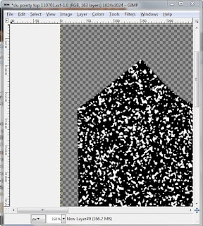
  • Use Filter->Noise->HSV Noise, setting the Holdness and Hue to the smallest values you can, then play with S and V to create a peppering of white speckles in the darkish grey.
  • Use Color->Desaturate to get rid of the colors that have crept in.
  • Use Filter->Blur->Gaussian Blur to spread out the random speckles.  Remember to use your paths to put selection borders around the fabric again, it will confine your blur and keep it from spreading out to places you don't want it to go.
  • Use Color->Threshold... use your mouse to grab the little pointer thingie and move it to the left.  Watch your Layer-Mask-to-be and you'll see random white holes open up in it.
After this, you should have it looking rather like this picture to the picture below... your randomness will be different than mine, though.  (Duh!)

Pretty neat!  Huh?!

Ok now look at the finished product again. As you study it I think you'll see that there's a kind of vertical bias to the randomness.  That's not what we have here at all.  This is more of a peppery, clumpy randomness.  Nice in its own way, and it might be just what you want. 

Also, we need to invert the colors.  Make white black and black white.  The reason for this is that black is the color in a Layer Mask that allows the transparency and white is the color that shows the layer as it appears.

So.... a few more steps are called for:
  • Use Color->Invert to reverse black and white
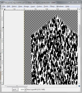
  • Use Filter->Blur->Motion Blur and set the length to 12 and the angle to 270.  Remember to surround the area with your selections again (from your paths) so you can control the blurring.
  • Use Color->Threshold as you did above to turn the blurred version into something more crisp, and make she holes (the black parts) the size you'd like.
Check out the picture to the right and you can see what mine looks like now. There's a strong vertical bias to the randomness now.

We're about ready to use it as a Layer Mask now.  Turn off the selection if its on (ctl-a), make sure you have the layer selected and copy it to your clipboard (ctl-c).

Now make the light layer we created at the start active, right click and choose Add Layer Mask.  When offered an option choose White.  That will let the whole layer show.  .... Then making sure that the layer is still selected, past the Layer Mask you have made to the one you have just created by pressing ctl-v.  Press the 'anchor' icon at the bottom to complete the operation.

Now comes the arty part.

I think its a good idea to make the sharp lines fuzzy again.  Use Gaussian Blur to do so - by now it is an old friend.  If you'd like to make the 'holes' bigger you can do so directly on the layer mask.  Use the Gaussian Blur / Threshold trick we used above.  You can do this as many times as you like until it looks good to you.

I also like to edit the layer mask directly and make the top part a little less 'holey'  so its connection to the top trim is not quite as tenuous.  If you right click on the layer, and make sure 'edit layer mask' and 'show layer mask' are both checked.  (Be sure to uncheck them before you make the texture)

Here's what my fabric looks like after all of that.

Whew!  That's enough for now!

I know, I know.  I didn't tell you how to do the other two things I mentioned at the top of this post.  But really, this is long enough... don't you think?  Perhaps I'll leave it as 'an exercise for the student'.  *snickers*

No, really.  I'll go through them in the next post.  But I'll bet you can figure it out for yourself. 

robin

Friday, July 1, 2011

Making a male skin

Hi again people!

[Edit by robin:  If you're looking for how to make a male skin, I've completed a new series of instructions that uses Eloh Eliot's Starlight skin as a starting point and makes it over into a male skin.  Here's the place to start:
http://robin-makingstuff.blogspot.com/2011/08/making-male-skin-part-2-and-plan-b-or.html
There are about 4 more posts after that one to show how to do it.]

I've noticed that there are several people interested in making a male skin.  I posted in one of the Second Life Forums that Eloh Eliot provided a male prototype as she did several female prototypes.  Unfortunately she didn't post that male prototype on the link I gave you for the female skins. 

However, it turns out that she did post them earlier, and others have copies of that post, so the male skin prototypes are out there somewhere.  If you google for lf0y_pdss.zip, you'll find them.  (That's pronounced 'ell eff zero why' )  Download the file and unzip it.  In the new directory you'll find three pds files.  Load them one by one into GIMP and save them as xcf files... then you're on your way.

The main problem I see with the Male skins from Eloh is the body hair.  The pubic hair is the same as on the female skins, and it's not quite right for a guy.  Also there's no leg, butt, back, chest or under-arm hair.  (To get an idea of male body hair, google the same with google image.  *fans herself* )

As it is, the male skin would be appropriate for a young boy avatar.  If you fiddle with the pubic hair enough you could probably get it to be close enough to do a teenager's skin.  Some leg hair and chest hair would take it into the territory of an adult male I haven't sorted out how to do that.  If anyone has an idea on how to do it, let me know.

robin