Monday, October 24, 2011

Making your own shape

Hi again everyone!

I thought I'd try to say a few words about making your own shape in Second Life.  I mean using the Edit Appearance thingie that Linden Labs provides, not making shapes for Mesh.   Its an amazingly flexible editor for your physical form and able to do all sorts of interesting things.   Yet.... as I wander Second Life, I think that most people buy their shapes and so many many people end up looking the same as every body else.  It's really not that hard to make your own shape... or if you have a shape you mostly like, tweak that shape in small ways to make it uniquely yours.

The Art of making a shape

There is an Art to making a shape.  A sort of undefinable something that's really hard to describe.  And its true that some people have this 'something' and some simply do not.  But its not a binary thing at all, there are degrees of Arty-ness in all of us.  Some of it is a matter of skills and knowledge.  I hope  to show you how to improve both of those in this post.  But some of it is also a matter of having an 'eye' for beauty and what is 'right'.  There will be people who have the skills and knowledge and have this 'eye' too and they will be able to produce avatars of exceptional beauty.   Hopefully, some of these people have opened stores and are selling their wares... but that doesn't remove our interest in doing our own thing. You may or may not see yourself as arty... set that aside for a while and give it a try.  I think most people have more arty-ness in them than they think. 


The point of this post is not so much for you to make shapes that you can sell.... But for you to be able to make your shape feel right to you... to be right for you.  And for your shape to be unique....just for you.


I'm not sure where I fall in the spectrum of arty-ness... I think I do have some degree of the 'eye' for beauty, but I am regularly impressed by some Avatars I see and simply go, 'Wow, how did they do that?!"  And then I have the fun of trying to figure it out. 

Height

The first question that pops up in making your own avatar is the question of height.   My avatar is a realistic height though a bit on the short side at 5' 1".  And often in a group of random people in SL, I'm a shrimp.  I'd really like to know what the average height of avatars in SL are but I don't know of any such statistics.  I think most women are well over 6 feet tall, and most men are well over 7 feet tall... I couldn't prove it though.   I'm speaking of the non-furry community here.  Furries, to their credit, do not seem to suffer from the need for greater height. 

Some of the height confusion has to be laid at LL's doorstep.  Their otherwise fine AV Shape editor seems to give an incorrect estimate of height in all situations.  I'm 5-1 and yet the AV shape editor reports me as being 5.76 feet, which works out to about 5-9.  There is a simple command in LSL (Linden Script Language) that returns the height of the Avatar (with shoes, oddly enough) so its not like its a mystery or difficult.  Maybe in a future post I'll show you how to create a thingie to measure your avatar's height... its really not hard at all.

For now... let's set the question of height aside and focus on proportions.  How long should legs be, in proportion to the rest of your body?  How long should your arms be?  How large should your hands be?  And for women, how to get your breasts to look realistic?  And.... 

How do you know how you look?  Well you have to look at yourself, of course.  Second Life provides a nice way of doing this and I have found that many people who have problems with their shape are ignorant of this feature... So we'll make sure you can all see yourself by talking about that first.


Camming


Camming is a strange word... it means to manipulate your view of the world in second life to something that is not the normal 'above and behind' view that you see as you walk around.  The reason its called 'camming' is that it refers to an invisible and not so imaginary camera that your viewer uses to see what is going on in Second Life.  As you walk around, that camera is above and behind your head looking slightly down.  So.... that's why you see what you see.  When you 'cam'  you are moving that camera around.  You can move it to look more closely at distant things, or use it to look at yourself from all angles.


Here's how you do it....
  • Place your right hand on your mouse and your left had over the alt and control keys on the left side of the keyboard.
  • Press and HOLD DOWN the alt key and click your left mouse button down AND HOLD IT DOWN.
  • Now move your mouse.  Right and left... Forward and backward.  Notice how your 'view' moves.  That is your camera moving... you are camming.
  • Now continue to hold down the alt key and the left mouse button, and use another finger on your left hand to ALSO press and HOLD DOWN the control key.
  • Move your mouse some more... Right and left, forward and backward.  Notice that the forward and backward motion is now different than it was before.
  • (To get back to the normal above and behind view, press escape. )
That's it!  You're camming!  Now use it to look at your shape carefully and critically.  Is there something that doesn't look quite right?  Not looking the way you thought it should?  It's a common problem.


What if you don't have a mouse?  How about those with a laptop?


Well, I'm sorry to say this, but you really should get a mouse.  Get a nice small wireless mouse and use it for this if you use it for nothing else.  They're not expensive.   I use a laptop myself and have done so for many years, and I think a mouse is really needed for a good Second Life experience.  If you have one of the Lenovo Thinkpads (was IBM) you do have a good alternative to a mouse in that little red nubby thing in the middle of the keyboard.  But for everyone else, you'll need a mouse.


What about the Mac users?  Control?  Alt?  What's that?   After a bit of Googling I found this:  In short, the Control key is the Mac's Command key.  And the Alt key is the Mac's Option key.


Proportions

I'll avoid the whole, what is beautiful and what is handsome question like the plague.  *grins*   Instead we'll talk about proportions.  What is 'normal' for the human body.  Of course, you may fairly question the idea of 'normal' but if you google human proportions you'll find a broad literature talking about it.  As you look through these links, you'll find that the 'head length' seems to be the standard measure and you'll quickly find that we are all supposed to be 8 head-length's tall.  We're not of course.  Here's a good video that will give you an introduction to the whole idea of proportions and also inject some reality into the whole 8-head-length idea.

Human Proportion 

Also look at this site...I think the images are particularly nice.  Note that the male figures also say that the normal is about 7 1/2 heads tall.

Human proportion images 

The thing is... *coughs* .... who wants to be just.... well.... normal?

No one of course.  *grins*  We want to be models, or heros, or Orcs, or Gnomes, or something else.  But certainly not normal.  This is SECOND Life after all.  But even with that, normal is a good place to start.  And making our legs a little longer, our breasts a little bigger and perhaps a little less sagging is all part of the game.  And for men, having that broad chest with massive pects and biceps, and all without steroids!  Well, its a good thing.

Personally, I think the guy in the video tape makes a good case for a 7 1/2 heads starting point with legs 4 heads long and arms 3 heads long.  Then if you want to go for a modeling/fashion look... then lengthen your legs and body slightly.

Common Proportioning Errors

As I wander through second life I do see some errors people have made in their shapes.  Usually a person will jave just one of these errors, rarely do I see someone with two and I don't think I've ever seen someone with three.  But I thought I'd list them so you can increase the power of your observations. 

And... who knows... you might see one of these in your own shape.  If you do, and want to make a change to your shape, be sure to do it on a COPY of your shape.  I've done this so often to my shape that I've taken to adding a date to the modification I make, and a height I'm trying for too.  So I have shapes named things like "Robin's 5-1 110205" where that number is a YYMMDD format.
  • Too long legs!  We all want longish legs, that's what high-heels are all about.  But there can be such a thing as too long.  When you start looking like you might be on stilts, that's the time to wonder. If you're a woman remember to look at yourself in heels.  That adds another 4 to 6 inches and may just put you over the top.
  • Too short arms!  If you use the Second Life avatar shape editor and just increase your height, there's a good chance that you'll end up with arms that are too short.  They should be about 3 heads long.
  • Push-up bra breasts.... with no bra!  This is a common problem with home made avatars, and quite a few store-bought avatar shapes as well.  If your breasts look like someone pasted half of cantaloupes to your chest, then this is your problem.  Breasts do not have the same shape at the top as they do at the bottom... There's this thing called gravity!    If you want the push-up bra look when you're dressed, that's certainly an ok thing -- but then be sure to make another version of your shape for when you're undressed or in a bathing suit.  You'll be much happier with the result.
  • Too small a head!  I see this quite often on guys.  They have increased their height, chest size and muscles but have done nothing for their head.  So... guys... you don't want to look like a pin-head do you?  Make it a bit bigger... and your neck a bit thicker too.  Try for at least a size that would make your height 9 heads total.  Eight would be better.  That doesn't mean I'm suggesting you reduce your height... just increase the size of your head.
  • Scrunched bottom!  I see a lot of people, both men and women who's bottoms that are scrunched vertically.  Its quite strange looking in naturalist or nudist Sim.  I suppose its no big deal if you never get naked though.  The fix is in the torso->hip length control  make your hips Longer.
  • Too long a trunk!  I think what some women have done is to take their basic shape and make it a bit shorter.  But the SL shape editor does not reduce height proportionately across the entire body.... I think it focuses mostly on the legs.  So this might also be titled 'too short legs' but if shorter is what you're trying for, then your legs may be ok - its your trunk shoulders to crotch that is too long.To fix this use the controls to control the Hip and Torso length.  Also watch the Neck length too.
Then there are facial features.....
  • Pasted on smile! I know, I know, this person is trying to communicate that he or she is a friendly and happy person.  But using the up-turned corners on the mouth control in the SL avatar editor to make this happen just looks scary.  Instead get one of those things that make you smile every now and then.  Come to think of it... that's something I can easily show you how to make in a future post.
  • Surprised eyes!  Its easy to make your eyes too open, too round.  I've done it myself.  When you do so it makes you look like you're surprised all of the time.  
  • Jaw-line too high, too sharp!  I think this is simply a flaw in the editor, it lets you make your jawline much too upward sloping.  It might be a good thing if you're trying to make an avatar of the Wicked Witch of the West (along with the required green skin).  But for most of us its way too much.
And finally, Avatar physics.  We can now have bouncy boobies, bottoms and bellies.  *grins*  If you're making a 'full figured' female avatar, the avatar physics can be a lot of fun.

First for the guys... if you're going for a buff look, I think I'd skip avatar physics completely.  Being buff, and having things jiggling is just not right, and could be downright disturbing.  If, however, you're making an overweight avatar, by all means, go for it.  You can get a jiggling belly, butt and man-boobs very easily.

Now for us ladies...  My advice would be to copy your walk animation from your AO and then run it in-world so you can see the effect of the changes you make.  Use the Camming we talked about above to look at yourself from the front as you use the animation to walk in place.  Walking is the most common thing, but turning, jumping and running are important too - so if you can do those as well, by all means do so.

Assuming you're going for a trim figure, you will want to minimize the belly bounce, perhaps you will want just a little butt bounce and your boobie bounce and sway will depend on how your breasts are shaped.  Larger and more pendulous, more bounce and sway... smaller, less bounce and sway.

If you're making a pregnant shape, play attention to the advanced parameters too.  Adding some Mass and Gravity to your belly will move it down a little into a more natural position.  And some mass and gravity on our breasts can make them sag and sway more realistically.

Avatar physics errors....
  • Everything is moving!  The most comon problem I see is for everything to be moving all over the place. If you're a heavy woman, then that's appropriate when you're walking around naked... but not so much when you're clothed.  You may want to make two avatar physics layers one for each condition.
  • Prim thingies don't move with my avatar physics!  If you have a dress with a prim lace trim along the top passing over your breasts.  And you have turned your avatar physics on, you will find that your prim lace will be stationary as your breasts bounce and sway though the lace.  Its even worse if you have bought prim nipples.  I'll leave it to your imagination.  The solution?  Don't wear the prim... or don't wear the avatar physics layer.  Its as simple as that.
What to do?!  

I've probably scared you off now.  So many ways to go wrong!

It's not really that bad though.  You're probably fairly happy with the shape you have but just want to make a little change.  Perhaps your lips need to be a little more full... or you need more lower lip .... or your nose is too narrow... or you breasts are too small.  All of those things are easy and simple to adjust.  Just remember to make your adjustments to a copy of your current shape so you have a way to back up without having to remember each and every tweak you made.

I'll use myself as an example for you.  At times, I like to play using the Mama Allpa hud.  It gives me a realistic menstrual cycle and a few other things too... like the possibility of pregnancy. 
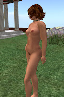
So... if that happens, I need to adjust my shape as I proceed through my pregnancy...  What I do is make up three more shapes based on my normal shape.  First here's my normal shape to the right.  (as always click on the picture to see a larger version - and you may be able to click again to see an even larger version).

Now to the left... here's a picture with my tummy made a bit larger, I call it 'showing'.  To make my baby bump on this shape I increased the belly control in the torso section going from about 1 on the SL Avatar Editor to about 25 or so.
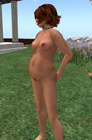
And now to the right is my 'trimester 2' shape.  Well, kinda mid to late trimester 2.  *smiles*.  In this one my breasts are a little bigger too, and I increased the gravity so they would droop realistically.  All of these controls are also found in the torso section.
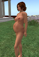
And finally, to the left is my trimester 3 shape.  My tummy is certainly larger and my breasts are too.  I also used the cleavage control to pull my breasts closer together a bit.  If you don't it starts to feel like they're flopping under your arms!  And I increased the gravity yet again. 

I might also increase my butt size and add weight in general by using the control to make my shape more 'muscular'.  It's not muscles in this case of course, but it's the effect we want.

All of these shapes have the Avatar Physics layer applied and have gravity and mass set for my breasts and tummy.  It does make a difference but you can't see it in the Avatar editor, you have to make the change and look at the result when you leave the editor.

This is just an example of course and a simple one at that.  But you can do it.  Study the proportions and give it a try.  Its fun!

robin

PS: A shape begs the question of a skin.  If you're new to this blog there are a couple of points to enter to learn how to make a nice skin for yourself.  One, for general skills and leading to making a female skin is here.   If you want to make a male skin, you should look at the starting point for the female skin and then go here.    (I had several false starts on the male skin.)  And if you want to make a dark skin, also look here.


Tuesday, October 11, 2011

Making a dark skin

Hi again!

I've promised several times to talk about making a dark skin, and I think I've started writing something on it at least 4 times... Each time I ran into complications that I couldn't easily translate into instructions so I set it aside and later tried again.   I've not been able to reduce this to a set of relatively simple instructions.   Its rather like the Starlight Male Skin I took you through earlier but even more so.  It tends to be a very artistic endeavor, lots of lots of personal and subjective stuff - so what I might prefer and what you might prefer could easily be very different.

So, what I thought I'd do, on this 5th try to say something about dark skins, is to just talk about some of those choices.   This won't be a how-to... instead it will be a guidance. It will give you some things to think about as you embark on making a dark skin and give you my perspective on them.

For me, the main questions in making a dark skin are these:
  • How dark a skin can I make?
  • What happens with shadows and highlights on my dark skin.
  • Are there things about dark skins that are different from the lighter skins we've made so far?
How Dark?

Let's face it, our skin color (speaking as one human being to another) varies all over the place.  Some of our skins are very very dark, some are very very light, and of course there is everything in between.  When I say "dark skin", I mean the skins of people with a sub-Saharan African ancestry.  You may mean something different of course, and that is fine. It's just that I just have more experience with people of that ancestry so I can look closely at skins of that type and study them the detail.

I've found, through the school of hard knocks, that if we make a very dark skin with a true to life very dark color, or a very light skin with a true to life very light color, that Second Life renders them very poorly.  It's sad but true.  The problem with a very dark skin is that SL's nighttime will tend to make you invisible.  That's ok if you're having a running gun battle in some combat Sim at night, but generally not so ok.  It's good to be seen.  Also your dark skin needs to be able to have both shadows and highlights... if you start with a very dark skin color, you really have no where to go with the shadows.

The problem with a very light skin is that SL's nearby lights, and sometimes even just daylight, can make the skin seem garish and washed out.  If your intended style is garish, I suppose that's ok.  But its really not going to do for most of us.  And here too, your skin needs to be able to have both shadows and highlights.... if you start with a very light skin color, you really have no where to go with the highlights.

So the thing to do is to pick a color that's dark, but not quite as dark as our skins can get in real life. Exactly what this color is is up to you.  For me, I find that something like HSV = 22,71,42 works pretty well.  I would describe it as a dark mocha.  It is by no means the deepest darkest brown that I've seen in real life but its a nice color.

For those into quasi-human avatars, other colors are fun and interesting too.  Especially dark reds and dark greys.  I've tried a few other colors, violets, greens and such.. and they will look good in some SL lighting but seem to look bad in other SL lighting.  A dark red value that I like is HSV = 3,62,55.  A dark grey value I like is HSV = 0,0,39.  We'll talk a bit more about these later.

Shadows

Of course, the place to start is with the values given us by Eloh Eliot in her Starlight skin.  But, if you're making the sub-Saharan-African skin.. you'll find that it looks pretty bland.  The shadows are not deep enough and the highlights are not bright enough.

So the obvious answer is to somehow make the shadows deeper and the light parts lighter.  But....as the old map-makers said when they warned the captains of ships that they were sailing into dangerous or uncharted waters , 'Here be Dragons!" The danger is that IF you modify the upper and lower textures slightly differently, you will create a line at your waist between the two layers.  This is the death knell of any skin.

So.... some advice....  Break the Highlights and shadows down into smaller jobs. What I do is first is the shadows.

For the dark skin color  (HSV) I described above, I created a new layer and applied that new dark skin color to it.  Then I went through each of the files that Eloh gives us, and made a copy of each shadow layer.  This was mostly those that used the multiply mode, but there were exceptions that I had to handle differently.  Things like nipples and lips, and perhaps makeup around the eyes.

Once you've duplicated the shadow layers in each file you'll probably go back and want to modify of the opacity of some of the duplicates.  GIMP gives you the ability to adjust it in fine detail using the slider, but I've found that this is a bad idea.  If you use the slider and you're just 'eyeballing' it, the danger is that you think you're doing the same level of opacity on a layer on the upper, and one on the lower, but you're not.  They'll be just a little off and before you know it you have the dreaded line between the upper and lower skin textures.

So, what I do is pick just a few values for my opacity and stick to them.  The values I use are these: 0, 11, 22, 33, 44, 55, 66, 77, 88, 100.  When I make a change, I usually also make a change to the name of the layer so its something like this 'abs.shadow 88'  where 88 is the opacity value I've set. This does two things... it makes it less likely that I will screw up and make the abs.shadow on the upper layer 87 and the abs.shadow layer on the lower texture 89.  And... WHEN (not if)  I screw things up I know where to look to fix things.

Highlights

Highlights on dark skins are really interesting.   It's good to keep an eye out on real life and really study what you see.  When I do this I see two very different kinds of highlights.

One type of highlight I see is the bright shiny whitish reflection.  I usually see this when outside in full sunlight... and its probably a warm day too.  So people have a light film of moisture on their skins and it reflects the sunlight in a very direct way.  The edges of these reflections also tend to be sharper.  Not a crisp line mind you, skin is not a metallic surface like a car.  Think how your skin reflects light when you've put a layer of suntan oil on and you'll have the idea... then tone it down a little, 'cause a little sweat is not suntan oil.  :-P

The second type of highlight is much more subtle.  It happens when the light penetrates the outer surface of the skin, diffuses and reflects back through the skin from the inside.  The light picks up a warm tint while doing this and lightens the surface of the skin without appearing to be white.   This is the kind of reflection tends to have a much softer edge to it.  In fact, the edge is so soft its hard to say it has an edge at all.  And its very much NOT a white reflection, its more a warming of the natural skin color.  On a pale skinned person it will tend toward pink and on a brown skinned person it will tend to a warmer, brown... maybe adding a little orange to the underlying brown, but it's still brown.

It occurs to me that some people may not be familar with the idea of warm colors and cool colors.  It's a pretty common way of describing things and if you look on the compact flourescent light bulbs you can by in the grocery store, you'll notice that they list something called color temperature.  The lower numbers are warmer, they have more red, orange and yellow.  The higher numbers are cooler, they have more blue.  Here's a link with more than you'll want to know about color temperature.  :-P

Color Temperature

The types of highlights that Eloh Eliot has given us with the Starlight skin is the second type.  So what we will be looking for as we make the highlights brighter is a shift in the color to something lighter and warmer... not a layer of white on top of the darker skin.

As I suggested with the shadows above... I would just go through each of the layers and duplicate them as a first step.  This raises a question though... there are really two kinds of these highlights in Eloh's files.  One is called "Shift' and the other is called "Highlight" or "Light".  My personal experience has been duplicate the Shifts and leave the Highlights and Lights alone.  As they say... YMMV  (Your Milage May Vary) .... you may find that you like to use the highlights rather than the shifts to do this.   Give it a try... but if you do, be sure you leave an easy way back to a good starting point so you can recover if you don't like the result.

We have the same danger here as we did with the shadows... so look at the waist where the upper and lower textures come together very carefully.  If there's a line... you've messed up somewhere.  And you'll need to either figure it out or start from your last save-point and give it another try.

Let's return for a few minutes to the quasi-human avatars, dark-red and a dark-grey and talk about highlights.  For the dark-red, I've found that I can use the same approach that I've described above and it works very well.  But.... dark-grey shows an interesting problem.  If you repeat the above for the highlights of a dark-grey skin, you'll find that the highlights take on a warmish cast.  This is not a good thing in a grey skin.  Fortunately the solution is pretty straightforward ... go through each highlight layer and desaturate it (Color->desaturate).  You'll need to do this for both the shift layers and the highlight layers.... and you may find you need to do some work on the nipples and lips too.

And if you get brave and venture further into other colors like blue and green, be sure to desaturate as you would for the grey, it would not do to have warmer highlights on a cooler skin color.


What's different?

Finally there's the question of how dark skins are different than lighter skins.  I'm thinking of the dark skins of sub-Saharan African's here... and the lighter skins of Northern Europeans and I do see several differences.

But first, let's talk about where things are the same.

Many light skins and even some darker skins include tan-lines.  For those of you who live in a cave or perhaps a sub-basement and never come out, tan-lines are the imprint made by a bathing suit, usually a bikini, as it blocks the sun's tanning rays.  This can happen for most people with light skins and for some people with the lighter shades of dark skins.  Some consider such things unsightly, and they can be a problem if you have bathing suits of different styles.  I'm ignoring tan-lines here but you may not want to do so.  If you want to add them, you'll need to read the sections of this blog where I talk about how to make a tank top.  Your cut for your bikini tan-lines will be different, of course.  But the principles will be the same.  And... be sure to make yourself a bikini that matches!

There is another skin color variation that I'm ignoring as well.  It's also due to tanning.  The shoulders and back of most light skinned people who spend a good bit of time in the sun will be darker than their fonts.  And under-arms are often even lighter than the fronts.  Of course if you visit the tanning salons you're getting an all over even tan... and you can do so in the natural sun as well.. you just have to be more intentional about it.  And as above, people with lighter shades of darker skins will show these tendencies of tanning as well.

I'm simply ignoring all of this sun related tanning and assuming you're running around in the bright sun naked all of the time... then spending time laying on your back with arms over your head to get a nice tan on your tummy too.  :-P

Now for the differences we WILL pay attention to....

The first difference is in fine detail of the the color of the skin itself. I find that dark skins are smoother in their color... or I could say that light skins have more small-grained variation in their color.  Freckles on a light skin are one obvious example.  Age spots are another.  But even ignoring these things you can see the blue of veins and small variations in the skin color itself on a light skin.  Adding veins is beyond the scope of what we're about here, but I do add something to give me this micro-variation in the overall skin color when making a light skin, and then use the freckle layers provided by Eloh.  On dark skins I would turn off the freckles and not do anything to give the skin the fine-grained variations.

The second difference is to notice places where the dark skins are lighter.  For those of a sub-Saharan-African ancestry, the palms of the hand are usually a bit lighter shade of brown and the soles and heels of the feet are as well.  This is really really tricky to create but its a very visible feature so I think it's important to add it to your dark skin.

The problem is that the palm is on one portion of the template and the back of the hand is on another portion of the template.  So if you do the obvious thing and make the back of the hand dark and the palm lighter, you'll end up with a very visible line running through the side of each finger, and a line at the underside of the wrist.  Bad, bad!  It will not do!

The solution is extend the lighter color into the template for the back of the hand.  But you have to do with with a fuzzy paintbrush.  And that fuzzy paintbrush cannot intersect with the edge of the template at all.  If it does, you will create the very line you're trying to avoid.  ( You can see my result in the picture to the right. )

The way to do this is create a layer mask over your skin layer and then paint with a fuzzy paintbrush over the areas where you want the light color to show through.  (You will have to create a layer with the lighter color below your skin layer.)  To do this you'll need to zoom in on the portions of the fingers and do each one very carefully.

Or you can create paths that are like the bones of the fingers and use the fuzzy paint-brush along those paths trick that we used in creating the straps and trim of the tank top in earlier posts.  It CAN be done!  But it is NOT easy.

There is one more place on a dark, sub-Saharan-African skin that shows some color variation.  The lower lip of some people with such ancestry is a little lighter than the upper lip.   I have no idea why, genetics I guess.  But if you google the question you'll find lots of discussion on both sides.  So it's optional, but its something you may want to consider doing.

The way I did this is to make layers that separate the upper lip from the lower lip.  To do this make two copies of the lipsA.base.darker layer and name one lipsA.base.darker.upper and the other lipsA.base.darker.lower.  Then add a black layer mask to both and on the upper make the area of the upper lip white, and on the other, make the area of the lower lip white. Now you can control the lightness and darkness of the upper and lower lips separately.

Dark skin wrap-up

As I mentioned at the start, making a dark skin from Eloh's Starlight skin is not an easy thing to do.  But it IS possible and the results do look good.   Here's a picture of my end result with the color I gave you earlier (picture to the right - double click on it for a larger view).  This is not the skin I normally wear, but I would be happy to do so.  It is a very nice skin.


And here's a picture of the same skin at night (on the left).  Both of these pictures are un-retouched and taken using a viewer 2 style viewer at with the High graphics setting.

You may be thinking that this is all well and good but my dark-mocha is not what you think of as a dark skin, and you want to go darker.  By all means... do so!  That's part of the art of this - you get to choose what you do... don't feel that you need to follow what I've done.

I haven't tried to go darker than this. If I did I would guess that the areas I described above would be the issue areas.  Perhaps you will need to make more copies of the shadow areas... or less.  Or more copies of the shift areas... or make copies of the highlight areas too.  As you do this... be sure you do it in small steps so you can check your work with temporary textures uploaded to SL.  That will let you find the flaws that get introduced as we mess with Eloh's layers and fix them.

One last suggestion as you launch off into creating your own dark skin....  Once you've created all three templates for your new dark skin and tried them out.  And you've fixed the line that showed up between the upper and lower layers, perhaps you even fixed it several times..... Wear the temporary skin for a couple days - you may even have to reload the temporary templates and reapply them to the skin.  I find that when I do this I notice little details that will bug me and I'll need to do something to change them.  Once you can wear the skin for a day or two and are still happy with it.... THEN upload the textures as permanent textures and apply them to your skin.

kisses!
robin

PS:  You may have noticed some problems with the pictures on this blog.  I think I figured out the problem... it was probably my own doing.  And I think the pictures should be visible to everyone now.  Please let me know if you find that's not so.


Monday, September 19, 2011

Changing the color of your tank top

Hi again everyone!

A few posts back, I showed you how to make a nice tank top.  Then I showed you how to do some variations on the theme and ended up with a very nice tank top with a kind of randomized fabric.  It was kinda putzy to make though and if you wanted to make several versions in different colors... well it would quickly become tedious.

Soooo....

I thought I'd show you a little short-cut.  A way to change the color without having to create the entire top.   The trick is to use something called "Rotate Colors".

If you're reading this and stratching your head, saying things like 'what tank top?  what randomized fabric?'  then you may need to go back and look at some previous posts.  Here are some that are germane in reverse order (newer first, older last):
  • Randomized Fabric 
  • Making a Tank Top ... this is the first of a series and it starts with a small GIMP lesson.
  • Tools you'll need ... this is near the very beginning of the blog and is the start of a series to make a female skin.  You will not need to go into that in detail but there might be some GIMP things in that series you need to know.
Ok... now let's get going on changing the colors.  You can look at the "Randomized Fabric" link above and see what we made last time, but I'll give you another picture here.  Its a very nice top if I do say so myself and I rather like the various shades of rose and pink that it uses.

And yes, the baby is born.  She is a bouncing baby girl and at birth was  8 lbs 6 oz.  (ouch!)  Mommy and little Fiona are doing fine.

First a few words about this pink/rose tank top.....

Recall that we used the same Hue on all of the colors we used in our randomized fabric above.   That's the H in the HSV color scheme.  So we just varied the Saturation and/or Value as we created our new colors.  Also recall that there are just three colors in the above.  The fabric itself has a darker background and a randomized lighter foreground.  The trim is the same Hue and lighter yet.  All have bump maps applied to them.  On the background fabric and the randomized fabric, these bump maps create wrinkles.  On the trim they create a kind of 3d-ish look, a nice rounded bump for each little bump that makes the trim.  And finally, we happily took Eloh Eliot's layers from her Starlight Skin to create the highlights and shadows that apply to all.

Now, exactly how do we change the color?

What we need to do is to change the Hue of four layers:  The background fabric layer, The randomized fabric layer, The straps layer and The trim layer.  So here's what we we do:
  • Select the background fabric layer in GIMP's layers window,
  • Then go to the Image window and choose Colors->Map->Rotate Colors.
  • I wanted to shift the Hue to more of a Purple/violet with just a touch of red in it...so I rotated the two arrows clockwise about 80 degrees so they encompassed the that area on the spectrum shown in the bottom circle.  The values I ended up with were 1.580 and 1.8180 in the two fields.  You can choose some other color to shift to - but make sure to note the values... you will need to apply the SAME value to the other layers.
Now select the randomized layer of the fabric and apply the same rotation (you copied down the values... right?).  Then do the same thing to the two trim layers.

One trick that I may have mentioned before to lighten or darken the whole thing after you have created it is to add a white layer above all of your fabric and trim layers and set the mode to grain extract or grain add.  Then use the opacity to control how much is extracted or added.  Its an easy way of getting the final lightness or darkness you want without having to redo the whole thing.

When you're happy with your result be sure to save the file and give it a different name.  As usual, I appended a YYMMDD thing to the end of mine as I saved the XCF file (GIMP file).  Then I saved the same thing as a png for uploading into second life.  (See some of the previous posts on details on how to do that).

You can see my result above. Pretty nice isn't it!?!  You can see that the wrinkles came over nicely and if you look closely you'll see the 3d-effect in the trim as well.

Have fun!
robin


Thursday, August 11, 2011

Making a male skin - Starlight Step 4

Hi People!

This will be the last step in making our male skin, making the body hair.  We have some preparatory work to do here, it's fairly simple but it will sound very odd when I tell you what it is. You'll have to just set your disbelief aside for a while and trust me.  We're going to create two new Paint Brushes for GIMP, one of the new brushes will be a single hair that curves to the left, and the other a single hair that curves to the right.

I know, I know.  A single hair?  As a paint brush?  I agree, it does sound pretty weird.  But what we'll do is use some of the more advanced capabilities of the Paint Brush tool to apply jitter (randomness) and some spacing to our new paint-brushes.  I think you'll be surprised at how easy it is, and how nice it looks.

Creating the paint brushes is a fairly mechanical process, probably about 70% mechanical and 30% creative.  The use of the paintbrush is easy but very creative, I would say that the values swap, 30% mechanical and 70% creative.

I did a google image search for 'male body hair'.  There is a huge variation from man to man and frankly some of the pictures are pretty scary.  But after looking them over you can get an idea of what looks 'normal' and what does not.  (You may have "other" ways of doing this survey of male body hair... we will not get into that here! *blushes* )

The obvious things are leg and arm hair - those are given. Facial hair is a given too.  Many (most?) guys shave but having a stubble seems to be a popular male 'marker' in SL.   Everyone also has pubic hair (duh!) but it's patten and density on the skin does vary a lot.  And everyone has underarm hair, but it's rarely seen in SL.  Many men do not have chest hair, but most do, and there are several distinct patterns to it.  You will have to choose your own pattern, or could create several as options.  And then there is butt, back and shoulder hair.  Personally I don't care for that so much and so I left it off.

One word about some limitations imposed by the Second Life textures on our hair creations.  A man's pubic hair often extends up from his tummy to his tummy and then to his chest, and if he has hair on his butt, it may do the same going up his back.  In Second Life terms, this crosses the lower template to the upper template and will create a seam at that boundary if we paint it in that way.  So plan to terminate the pubic hair below the seam and start any chest/tummy hair well above the seam.  And if you do butt and back hair, do the same there.

Now let's talk about the underarm hair for a moment.  I think we should have some but if you look at the area we'll be putting it, it is rife with seams.  This will sound strange, but we will go ahead and apply some hair there, ignoring all the dire warnings on seams and the creation thereof.  The truth of the matter is that the underarms are little seen, but applying some hair there let's a little poke out now and then in a natural way.  So my vote will be to put some in - you may decide for yourself of course.

Now let's get started.... the first step is to create these rather strange sounding GIMP hair paint brushes:

GIMP hair Paint Brushes

I have to admit from the start that most of my experience with male body hair has been with with males of the so-called Caucasian persuasion.  It has occured me me that people of other persuasions  may want to use a different 'style' hair here but I honestly don't know what guidance to give you.  If your experience tells you that this hair is wrong for the skin you are making, by all means pay attention to it and make a different hair than the one I will show you now.

Let's make a single hair GIMP paint brush (wow does that sound odd!):
  • Open GIMP and use File -> New and tell it to create a 16x16 image.
  • Now add a new transparent layer to that image using the button just below the list of layers in the Layers window.
  • Click on the Foreground color.  I set my color to a dark brown even though I am my skin is intended for an avatar with blond hair.  I suggest you do the same for now.  My HSV value is 32,86,23.
  • Choose the Paint Brush tool on the tools window and choose the smallest possible circular paint brush.  (1 pixel)
  • Make sure the new transparent layer is selected and  draw a single line starting near the top of the making a slight curve to the left as you do so.  (see the image of the hair I created)
  • If some spots look a little light due to anti-aliasing, go back and touch them up making them a little darker.
  • Now turn off the background white layer (click the eye) and use File->Save As and give the file the name "hair left.gbr"  when asked for a description, type in "Hair Left".
Now repeat the above process and create a hair that is curling slightly to the right.  Here's a picture of the left curling hair-paint-brush.

Now we need to move the paint brushes into the proper directory.  For windows 7, it's located in [YOUR ID]\.gimp-2.6\brushes, you can find it by clicking Start->[YOUR ID].  Mac and Linux users will have to find their equivalents for themselves.  Once you have the folder located, move the two gbr files you just created into it and exit GIMP.  The next time you start GIMP those brushes will be available.


Making Body Hair with GIMP Paint Brushes

Now for the creative part, we'll work though each texture in turn, starting with the lower texture .... we'll do the leg hair first.
  • restart GIMP loading your starlight_lower m yymmdd.xcf texture into it.
  • In your layer window, go to the top of the list, and near the top, just after the cmff base and the Another Skin layers, create a new transparent layer and call it male leg hair 1.
  • Turn on the cmff base layer and set its opacity to about 10%, you'll need this to guide you in the placement of the hair to come
  • Choose the Paint Brush tool from your tools window, select 'hair left' as your paint brush, turn on 'apply jitter', setting the amount of jitter to something between 5 and 10.  And set the spacing, found on the bottom of the Layer window and set it for about 10.  Experiment and see what you like - remember to use ctl-z to back up a step or two to erase your experiments.
  • Now exercise your creativity and paint the leg with hair.  You can adjust the scale up and down to create smaller hairs (0.8) and larger hairs (1.4).  I would suggest that there by less hair on the knee than in other places.   Try to keep the hair more sparse at the edge of the template (inner and outer thigh) to minimize the creation of seams as much as possible.
  • Once you feel your about halfway done, switch brushes to 'hair right' and repeat what you have done in the previous step, some hairs of scale 1, some of 0.8 and some of 1.4 or so.  If you'd like to create multiple layers for your leg hair, feel free to do so.  I would suggest doing so by hair size (scale).
  • As you play with this, adjust the opacity of the hair layer you're creating. If it's starting to look too dark you can either have less hair, or make the hair you have less opaque.
There is clearly a lot of latitude in creating the leg hair for your avatar.  If you make the hair rather sparse, the likelihood of creating a visible seam is small.  If you try to create 'fur' though, you may run into a problem with seams.  So my advice is to keep is sparse.

Once you're finished with the leg hair, create a new transparent layer for the pubic hair.  Follow the same proceedure as outlined above, but use larger scales in general and reduce the scale and the spacing.  The pubic hair should be darker, more dense and longer in general than the leg hair.   I found that I had to do some 'trimming' of the pubic hair after I'd created it using the eraser with a large fuzzy circular brush (scale about 8) and you may find you need to do the same.  But wait until you upload the temporary texture and apply it to your avatar to judge what you need to do.

Remember, for the pubic hair, keep it away from the waist of your template.  A seam in that area is VERY visible.    Here's a picture of what I ended up with when making this male skin... I ended up with two leg hair layers, both set to an opacity of 33, and one pubic hair layer set to an opacity of 55.

I expect you're a bit nervous about the hair extending beyond the edge of the leg templates...... me too!  So I did a quick check, uploading my starlight_lower m yymmdd.jpg as a temporary texture to check.  Here's the picture.... I can't see a seam.  Can you?  (click on the image to get a larger view)

I think that as we made the hair heavier and darker, there would be a point where the seam would begin to show.  But we're ok with what we have here.

Now its time to move to the upper texture.  So load starlight_upper m yymmdd.xcf and create three new transparent layers at the top of the list of layers.  I named mine male arm hair, male chest hair and male underarm hair

For the male arm hair, I used the same brushes but just the smaller versions, a scale of 0.8 and maybe a little 1.0. 
For the chest and underarm hair I used the three sizes we talked about earlier and you may want to adjust the jitter and the spacing as you change the size.

I set the opacity of the three layers to:
  • male arm hair = 40
  • male chest hair = 55
  • male underarm hair = 55
Finally the facial hair...  I'm sure you can guess the details by now so I won't repeat them.  :)

I just created a simple stubble for this, but you may want to try something more complex.  For a stubble do the same things we have been doing all along but make the hair size smaller, perhaps 0.7 or 0.6.  And likewise make the jitter smaller and the spacing smaller.  I set the opacity of the male facial hair layer to 88.

Now go back to the 'checking your work' in the last post and do it again.  This time upload your temporary textures with hair included.  You'll likely do this several times, I know I did. 

And finally after many uploads, iterations and adjustments..... you're done!!  You made a starlight male skin!  Congratulations!!

robin

PS:  In a future post I'll take my versions of this skin and change the skin tone to something darker.   My experience in the past with this sort of thing is that Second Life puts some limits on this sort of thing.  As it is possible for a skin to be too light for Second Life, it is also possible for a skin to be too dark.   There are real-life light skin colors that are just too light for Second Life to render well.  And there are real-life dark skin colors that are just too dark for Second Life to render well.   But never fear, we'll be able to make a nice dark skin, I'm sure.

Wednesday, August 10, 2011

Making a male skin - Starlight step 3

I'm back!

In the previous post we worked very hard making adjustments to the starlight upper texture and adding the necessary layers to allow it to be used in a male skin.  So now we'll work on the adjustments ( no additions) to the other two textures, the lower and the face. This will not be nearly as long or as arduous as the upper texture was, and you have gained valuable experience which should make this a piece of cake.

starlight_lower m yymmdd.xcf - buffed up and final adjustments

After all the work we did on the upper layer, this is going to be pretty anti-climatic.  There are really just two layers to work on to buff up the legs a bit.  Both layers involved the thigh muscle on the front of each leg.  As before the problem is that the highlight is a bit too smooth and we need to make it just a bit more lumpy. 

Before you get started do a google image search for male body models to get an idea of how this should look.  Here's what I did for my layer mask::
  • Turn on the grid for the cmff base layer as we have done before on the upper texture 
  • Turn off the 'front highlight thigh' layer.
  • Select the 'front.shift.thigh' layer, right click and choose 'add layer mask' as we have done before.  And make it white.
  • Select the Airbrush tool and make the foreground color black.  Make the scale about 6.
  • Now paint the area just above the knee to reduce the highlighting there.  I also reduced it a little bit toward the outside of each thigh slightly above the knee.  
  • As we always do, switch the color to white and touch up what you may have overdone, changing the size of the paintbrush as you need
  • and repeat the last two steps until you are satisfied.
Then, as we did before, find the 'front light thigh' layer, turn it back on and do the same thing we just did to the 'front shift thigh' layer..  Here's a picture of the layer mask I created.

That's it!  We're done with the fancy airbrushing and layer masks!  Take a break, walk around the room and SAVE YOUR FILE!

Now its time to make some adjustments to the intensity of the highlights.  This is subjective so if you decide you want more highlights than I do, or less, that's ok.  The important thing is that what you do for the upper highlights must be matched by what you do in the lower highlights.  (we won't be changing the shadows at all)  So immediately after making adjustments on the lower layer, we'll move to the upper and finally to the face, making adjustments to the layers there too.  All of these adjustments will just be to the opacity of the layers, we won't change the mode or do any more fancy airbrushing.

I'll go through a list of layers for the lower texture now and share the values for the opacity that I have used for this male skin... starting at the top and working our way down:
  • front.light.abs = 66
  • front light abdomen = 66
  • front light thigh = 66
  • front light knee = 66
  • front light shin = 66
  • front shift thigh = 100
  • back light buttock 1 = 66
  • back light buttock 2 = 66
When I change the opacity of a layer I usually make some note of it by adding something to the name of the layer.  It might be the number that I changed it to ... or it might be just some signal like "*" or "<<".  You might want to do the same.  You can feel free to adjust these values in the future to something more to your liking, but for now it's probably best to start with these.


starlight_upper m yymmdd.xcf ... final adjustments

Now here's the list of layers in the upper texture on which I have changed the opacity:
  • navel upper light = 66
  • navel bottom light = 66
  • breastB.chest light = 66
  • breast highlight male lower = 55
  • breast highlight male upper = 33
  • breastB.breast upper 66
  • breastB breast shade 1 = 100
  • collarbone = 44
  • abs highlight = 66
  • abs side = 66
  • abs shift = 100
  • arm lower light = 33
  • arm bicep light male = 55
  • arm upper light = 33
  • arm lower light = 33
As I said on the lower texture file, feel free to adjust these values to your liking sometime in the future.  But for now, I'd suggest that you use these.

starlight_face m yymmdd.xcf final adjustments

The main thing I did with face texture was to be sure the makeup is off, including lipstick, eye shadow and eye liner.  And then adjust the lip color to something that I liked.  To do this I set these layers as shown below:
  • lipsA base darker = 22, multiply
  • lipsA base lighter = off
  • lipsA base = off
And I then adjusted the facial highlights to match the highlights of the upper texture:
  • cheek corner light = 66
  • check light = 66
  • chin light = 66
  • eye bottom light = 66
  • forehead light = 66
  • ears light = 66
Also remember to experiment with the different choices of noses, lips and eyes. 

Ok!  We're done!  Yay!

Checking your work

The most awful thing that can occur in modifying one of Eloh's startlight skin is that the seams between textures and within the texture become visible.  The open source skin's Eloh provides us as starting points do NOT have visible seams, so if any show up they are simply our fault.

So.. it's time to check your work.  Load the latest versions of each of the textures you have been working on into GIMP.  For the upper and lower textures, save them as jpg files, for the face texture, save it as a png file.

Now we'll upload them into Second Life.  I recommend that you use a viewer that can upload temporary textures to do this because uploading temporary textures is free.  My current favorite to do this is Firestorm.  To upload a temporary texture you use Build->Upload->Texture, choose the texture when it shows you the folders and then tick the 'temporary' box when the viewer shows you the file you've selected, and click Upload.

Once you're logged in and have your textures uploaded its time to try them on.  You'll need to be somewhere where nudity is permitted, like an Adult Sandbox, or if you are not adult verified, find a place that is sparsely populated (use ctl-shift-1 and look at the Main Agents, that tells you the number of people in the Sim).   I'll be using Firestorm as my point of reference here so you'll have to interpret if you're using something else....
  • Press the inventory button and find the second inventory button at the bottom of the inventory window to open up a second inventory window. 
  • Make a copy of one of the skins in the Library and put it in a folder named 'body', then name the skin 'my skin yymmdd' and double click it to wear it.
  • Now right click your avatar and choose Appearance->edit outfit->body parts->(your skin name here)  (there's a little screw driver and wrench icon to click)
  • You will now see three small window-ish things at top labeled 'head tatto', 'upper tatto' and 'lower tatto'  (yes, I know its spelled 'tattoo').  That's where you will put the textures you have uploaded.
  • Open the textures folder in the left inventory window and drag each of the textures you have uploaded to the appropriate window on the right.
  • Press "Save" and then "X" to exit.
Now use your 'cam-ing skills' to closely inspect the seams of the skin you have just made.  Check each of these in turn
  • Upper/lower seam at the waist, front and back
  • Upper/face seam at the neck, front and back
  • Shoulder seam in the upper texture, front and back
  • Arm seam in the upper texture, down the bicep and in the back, along the tricep
  • leg seams in the lower texture - the outside of the leg and the inner leg
  • There are seams in the face texture too - but these usually don't seem to cause a problem, or are often covered by hair.
If you can actually SEE any of these seams, if you see a line of sorts in these places.... you have a problem that needs to be corrected.  There's no absolute prescription on how to do the correction, sometimes its a simple matter of finding the error and fixing it.  Sometimes you just have to begin again.

I tried to show you a way of doing the male skin here that would have a minimum of seam problems, so lets go on and look at what we've done.    Look at the male pects, lighting and shadow.  You may decide you need a little more or less of one or the other.  That's fine.  Once you have verified that you have no seams in your skin, you can go ahead and make changes to personalize it to the way you want to look.  Likewise inspect the abs... too much?  too little?  All of this is totally subjective and up to you.  Just be sure, as you make changes, to keep inspecting for the dreaded seams.... and provide yourself a way to backup to a previous level if you find you've introduced one.

And Finally.......

Once you're happy with the results of your hairless male skin, we can move on to the final step - making hair!  That's in the next post.

robin

Tuesday, August 9, 2011

Making a male skin - Starlight step 2

Hi again!

Today we'll work on "starlight_upper m yymmdd".  First we'll work on creating the male pectoral shading and highlights (aka pects) and then we'll work on the abdominal muscle definition (abs) and the bicep definition.  Let's get started. 

Nipples

My first thought was to simply turn on the nipple layers in the starlight skin given to us by Eloh. But after doing that and looking at the result... it didn't look quite right.  The nipples were not quite in the right spot for a man's skin and they were a bit on the large size.  So I decided to turn the starlight nipples off again and go get the nipples from the lf0y_upper file and work with those.   Here's my earlier post on how to find copies of lf0y on the web:

http://robin-makingstuff.blogspot.com/2011/07/making-male-skin.html

So go forth and download!

Once you've downloaded and unpacked the files, start GIMP and load lf0y_upper.psd into it.  Then....
  • Resize the file to 1024x1024 with Image->Scale Image and tell it 1024x1024
  • Find the 'nipples' layer and select it.  Then resize it using Layer -> Layer to Image Size.
  • Press Ctl-C to make a copy of the layer
  • Find and open your starlight upper file, 'starlight_upper m yymmdd.xcf"
  • Find the general area of the nipples layers and create a new transparent layer in a convenient place above or below them.  Then press Ctl-V to paste the lf0y nipples layer from your clipboard and click the anchor button to put it in the new transparent layer.
  • Change the name of this layer to 'nipples male'
  • Change the mode to multiply
The nipples look a little pale now but that will be easily remedied later.  First let's move them a bit to where we want them.
  • Make two copies of the 'nipple male' layer and change the names to 'nipple male left' and 'nipple male right'.
  • Turn on the grid by turning on the "cmff  base" layer.  Recall that in the last post we moved it to the top of the layers list and set the opacity to about 10%, so it should now be faintly visible.
  • Now select 'nipple male right', choose the Move tool from the Tools window and below on the Tools window select 'move the active layer'
  • If you look at the image to the right you can see where I moved the nipple to.  I tried to make it so that the upper right edge was just touching the old center point.  Use your mouse to move the nipple to a similar position. 
  • There will be a little of the nipple that spills beyond the ring around the center point... we need to trim that off or it will smear and look very odd.  So select the Eraser tool on the tools menu and adjust the scale to somewhere around 6 with a hard edged circle as the 'paint brush' and use the edge to nibble away at the part of the nipple outside the circle.
  • There were two nipples in each layer, so now we need to go erase the other.  Since we're working on the right nipple, we need to erase the left from this layer.  So use your Eraser tool to do so.
Now repeat the above process for the other nipple.  When you're done make copies of both and you should have a nice level of darkness for both nipples.

This is probably a good time to save your file.  Remember to give it a new date when you to so, or give it a number of a letter in addition if you already have a saved copy with todays date (like this starlight_upper m yymmdd-2.xcf)

Pectoral Muscles - Shadow

Next we'll work with the pects' shadow.  There is a bit of creative license in this step but it's not too bad.  It's probably about 60% mechanical and 40% creative.

In truth, it's strongly connected with the pects' higlights we'll be doing next so you may find yourself coming back here after you've done the highlghts.  Or you may find yourself iterating between the two for a while until you get them to a place you like.  That's ok.  In fact, its probably good that it happens.

I find that I could use the breast shadow as a base for our pect highlights... here's what I did:
  • make a copy of the layer 'breastB.breast shade 1' and turn it on.
What we need to do is to trim back the shadow from the nipple area, pushing it back down toward the edge.  A man's pect is much flatter than a woman's breast (duh!) so the shadow will not extend as far up to the nipple, but will be confined just to the lower edge.
  • Rt click on the layer and choose 'Add a layer mask' and choose a white mask.  A white mask will allow the whole of the layer to show through, and we can add black to it to trim the breast shadow back to where it should be for a male pectoral muscle.
  • Choose the Airbrush tool from the Tools window, and make the foreground color black. Then choose the largest fuzzy circle as the paint brush.  I've set the scale to about 6 or 8, and the rate to values you find comfortable to work with (experiment - remember ctl-z is your friend.
  • Use the large fuzzy black painbrush to nibble the shadow back, pushing it away from the nipple. 
  • Then with a smaller fuzzy paintbrush adjust the shadows that wrap around the breast both near the sternum and near the under-arms.  Be very careful as you do this to NOT get too close to the template edge!
  • You will then want to switch the colors and paint with black to clean up what you have done, making corrections and adjustments.
  • Repeat the above two or three steps until you're happy with the result.  You can see my result in the image to the right.

I'll also make the layer mask visible (right click the layer and select 'show layer mask' so you can see how mine ended up.  Yours need not look like this at all, but it will probably be similar in the important areas.


Pectoral Muscles - Highlights

Now the scary part!  The pects!  This is going to be the most creative of all of the things we need to do to make this a male skin. I would rate is at aout 30% mechanical and 70% creative. This will require some 'freehand' drawing using the airbrush similar to what we just did with the shadow, but more so.  We will be creating the highlight outright, not just modifying one that already exists.

You may want to take inventory of your 'pointing tools'.  On my laptop I have three, a 'track point', a 'track pad' and a wireless mouse.  (I'm using a Lenovo Thinkpad, which has a lineage going back to IBM, hence the Track Point, a red nubby thing in the middle of the keyboard).  Which you prefer is largely a personal choice - for general computer usage I seem to like: 1) the mouse, followed closely by 2) the Track Point and followed more distantly by 3) the Track Pad.   But for GIMP airbrush work I tend to reverse the last two, the Pad is better than the red-nubby thing for painting with the airbursh, but the mouse is still number one for me.  If you're using a laptop and dont have a mouse, by all means try this with your Pad.  But you may also want to invest a few dollars in a mouse and try that out if you have any trouble at all.

And, remember as we proceed into this that ctl-z is your friend.  You can always use that to back out your latest changes to the image.  Also remember that this is not a one-shot thing.  You can delete the layers and start over any time and you will not have lost any of your previous work.

I chose to do this in two stages, adding one layer for each stage.  The first is just to even out the lighting.  if you look again at the image above (not the one showing the layer mask) you will see a slightly darker band just above the pects.  The thing to do first is to lighten that band:
  • Select the "breastB.breast upper" layer and using the Color Picker tool, sample the color in that layer, making it the foreground color (you don't have to make the layer visible to do this, selecting it is enough)
  • Now create a new layer just above "breastB.breast upper" and let it take on the foreground color.
  • Right click and choose "add layer mask", choosing a black layer mask.  (we will paint white onto it in a few minutes)
  • Name your new layer 'breast highlights male upper' and set the mode to 'burn' and the opacity to 33%
  • Now choose the airbrush tool and make white the foreground color.  Choose the large fuzzy paint brush and set the scale to something largish, around 6 or so.  I have the rate and pressure at 80 and 10 but feel free to adjust them up and down.
  • Now use the airbrush and paint on the darker areas above the pects, making them lighter and lighter until they roughly match the lightness of the neighboring area.
  • Switch the foreground color to black and use that airbrush to make adjustment, switching back and forth between white and black until you are satisfied with your result.
  • You can see my result of this lightening to the right.
One thing to be aware of as you work create your highlights.  Keep your paint brushes away from the edge of the template.  If you do stray, use ctl-z to back it out and try again, perhaps adjusting the scale to make your brush a notch smaller.  This is important, if you don't stay away from the edges of the template, the edge will become visible on your skin and you'll see a sharp line where your arms join the chest.

Now repeat the above, putting the new layer (named breast highlights male) above the layer we just created.  On this layer we will use the same technique as above, but with a bigger paintbrush, setting the scale to 8 or so.  With this brush we will paint a broad squarish pectoral highlight over the lightening the whole area of the pectoral muscle.  Then switch to black and trim it and back to white as needed.  You may find, as I did, that changing the size of the paintbrush to something smaller using scale, and using the black color, can work well in defining the area between the right and left pectoral muscles.  Here's my final result to the right.

That's it!  The scary part is over!  You may not believe it at this point, but the highlights we've created here will look good on a male avatar.  Just remember that your not satisfied, you  can go back play with this making adjustments, adding, subtracting or even redoing as you feel the need. 

Chest highlight

Now we'll move on to some easier things.  First we'll look at the 'breastB.chest light' layer.  I'll rate this at 70% mechanical and 30% creative.  Turn the layer on and play with the opacity, adjusting the slider up and down until you get it to a level appropriate level considering how the highlights you just created look.

When I did that I found that some of the chest highlight overlapped with the highlights I had created so I added a white layer mask and used a black fuzzy airbrush to select the areas around the edges I wanted to de-emphasize.  Use the instructions in 'breastB.breast shade 1' to do this, applying them to 'breastB.chest light'.


Let's pause here for a moment...

First... you should congratulate yourself!  You've done the most difficult part of making the starlight male skin.  If you're like me you'll go back and fiddle with it, touching it up here and there, but really, the difficult part is done/over/finis! 

The next steps are to increase the muscle definition.  That's entirely appropriate for a for an adult male skin.  But not so much for a child's skin.  So if your goal here to make a skin appropriate for a child avatar (male or female), this is probably as far as you need to go.  Come to think of it, you're probably pretty much done with the other layers too, the face layer really won't need any changes and arguably the lower layer will not need any changes either.

If your goal is a child's skin, you will probably want to revisit the shadow and highlights above and lighten both, use the opacity slider to do so.  And you can feel free to skip the rest of this post and most of the next.  Look for the section in the next post where I talk about checking your work.

But... I suspect that most of you want to create a mature man's skin so we need to buff him up.  We'll work first on the abdominal muscles and then on the biceps.  And in a future step there will be more to do on the lower layer as well.


Abdominal Muscles - Six Pack

Next we want to work on the abs. I think this one is not so creative as the last, so would rate it at about 67% mechanical and 33% creative.  The goal here is to make the abs less smooth looking... to provide a hint of a six-pack, but not get carried away and go into body-builder mode.  If you look carefully at the abs in this file you will see that the highlights provided by Eloh in the Starlight files are smooth.  So the way to approach this is to subtract some of the highlighting to create the six-pack.

Before we start its a good idea to get firmly in mind what we're trying to do.  Since I don't personally have a lot of experience with male six-packs, I did a google image search of "male body models" and made an extensive study of the pictures.  *fans herself* 

Look particularly at the shadows between each of the abs, that's what we're going to be creating here.

There are two layers here that we'll need to be concerned with:  "abs shift"and "abs highlight".  Turn off "abs highlight" for now (click the eye), we'll work on "abs shift" first:
  • Go to the "cmff base" layer (at the top of the layers list) and turn it on, giving us a grid to work within.
  • Select the 'abs shift' layer, right click and choose 'add layer mask' .... make the new layer mask white. 
  • Now go to the Tools window and choose the Airbrush, the large fuzzy paintbrush, set the foreground color to black and the scale to about 2 or 3.  Adjust the rate and pressure to your liking.
  • Being very careful to NOT get near the edge of the template grid, paint a black line down the middle and then two crossing lines, one just above the belly button and another above that.
  • Change the color of your brush to white (and perhaps change its scale as well) and trim what you have done
  • Repeat with the black and white until you can see the hint of abs
Now turn on "abs highlight" and repeat the process above.  Marking the same areas of the layer mask you create with black and trimming with white - being careful to stay away from the edges of the template. 

Here's an image showing my "abs shift" layer mask.  Right click on the layer and click 'show layer mask' and you can compare it to your own.


Biceps and Shoulder

Now we're ready for the last step for this file. The biceps and shoulder muscles. 

This will be a mix of the techniques we've used above.  We're going to adjust some highlights like we did for the abs, and we're going to create a highlight like we did with the pectorals.  So this is a pretty creative process and but not so creative as the pects were.  I'd rate is at about 50% mechanical and 50% creative.

You'll find the arms layers about 2/3's of the way down the layers list, named 'arm upper light' and 'arm lower light'.  For these two, we're going to create a white layer mask as we did for the abs, then use a black airbrush to do some trimming of the highlight provided.  I'll not repeat the steps here, you can look above at the abs and get those if you need them. 

What I have done with the 'arm upper light' layer is leave the highlight in place on the shoulder, but eliminate it just below, to give definition to the shoulder muscle.  Then I've taken out the highlight running the length of the upper arm down to the elbow.  We'll add another highlight shortly to be the bicep, but this one is in the wrong place.  I'll add a picture of the layer mask to the right so you can see what i've done.

One thing to note as you look at it... I came dangerously close to the edge of the arm template and used the paint brush and the blur tool to make some small adjustments.  You may need to do the same.

The lower arm is similar and I came to the edge and beyond here too.  So you'll see where I did some remedial trimming and blurring.  It happens that its not too critical in either of these layers since the highlight we're editing is confined to the middle of the area that we're editing.

Now for the creative part.  Go back up and review how we made the layer for the pectoral muscle.  We first created a greyish layer (you can copy the pect layer now if you want) and then added a black layer mask (delete the pect layer mask and re-add a new pristine black layer mask.  Then get ready to paint.  Call the new layer 'arm bicep highlight male'.

The difference between this and the pects is that we'll need to use a much much narrower fuzzy paint brush for our airbrush.  And we have to be very very careful to NOT get too close to the edge of the arm part of the template.  Here's an image of the layer mask I created for the bicep highlight.  I circled the part that you should pay attention to - that's the bicep highlight.  Notice that it is NOT up against the edge of the arm template.  Making a highlight layer that will cross one template edge to another smoothly and invisibly is not within the scope of what we're trying to do.

Yay!

We've finished adjusting the starlight upper texture to make it a male skin.  Well, except for the body hair, which we will deal with later.  Really, the hardest part is over, I'd estimate we're about 2/3s of the way to being done.  So congratulations! ( remember to save your work!)

In the next post we'll work on the lower level, buffing it up a little as we did with the upper (while continuing to gaze at those 'male body model' images, purely as guidance of course!).  Then we'll revisit the face layer and see if there are any small adjustments to make there. 

We'll create body hair for this male skin in a post following the lower/face post and deal with body hair on all of the layers.

See ya!
robin